

01 · The caseTwo sales, one address
One project, two windows, five years apart — the transaction record before any analysis.
In the first year of our window, a unit at Marina One Residences changed hands at a median of S$2,404 per square foot. It was the address the whole market pointed at: a Gardens-by-the-Bay skyline, an MRT interchange under the building, the kind of postcode that appears in wealth reports.
In the twelve months to July 2026, the same project’s resales cleared at a median of S$1,910 psf. Not a single distressed unit — 49 separate transactions, settling 20.6% below where the project traded five years earlier.
Ten kilometres north-east, in a district most investors never shortlist, the opposite was happening quietly and consistently. This article is about the gap between those two facts, and why almost every buyer we meet has it backwards.
Put the same drop in dollars. On a 1,000 sq ft unit, the difference between S$2,404 and S$1,910 per square foot is roughly S$494,000 — not a paper adjustment but a number that decides whether a family moves, refinances, or stays put. Over the identical five years, an owner in Springleaf watching the same market reports would have seen their price per square foot rise by more than a third.
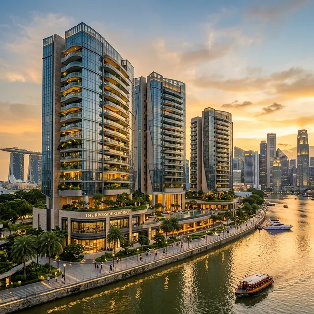
District 1 — Marina Bay and Raffles Place. The most expensive addresses in Singapore, and the only district in this five-year record that ended lower than it started.
S$2,404 → S$1,910 psf
the same five years
The most expensive address in the country lost a fifth of its price per square foot while a suburb most investors never shortlist gained more than a third.
02 · The claimThe safest postcode was the worst investment
What we are asserting, stated narrowly enough to be tested.
The assumption runs deep: prime districts hold value, suburbs are where you compromise. It is repeated in showflats, in bank marketing, in dinner-table advice from people who bought in the nineties. Over the last five years, in Singapore’s own transaction record, it was wrong — not marginally, but by nearly fifty percentage points from best district to worst.
We want to be precise about the claim, because a headline like this invites a fair objection. We are not saying prime property is a bad asset, that District 1 will keep falling, or that a heartland flat outperforms a Marina Bay penthouse in every window you choose. We are saying something narrower and harder to argue with: over these particular five years, measured on resale transactions in the public record, the districts that command the highest prices per square foot delivered the weakest price growth — and one of them delivered none at all.
The median district gained 24.8%. That is the number to hold in your head as a baseline: a typical Singapore district added roughly a quarter to its price per square foot in five years. Against that baseline, D01 didn’t merely lag. It went backwards while everything around it compounded.
03 · MethodHow we measured this
The dataset, the filters, the thresholds — and what we deliberately did not do.
Every figure in this article comes from URA caveat data — the record of actual transactions lodged with the state, not asking prices, not our own listings, not a survey.
- The dataset. 133,323 private transactions between July 2021 and July 2026 — sixty-one months of continuous record.
- The universe. We compare like with like: strata, non-landed, resale only, excluding Executive Condominiums. That leaves 61,135 transactions. New sales are excluded because developer pricing reflects launch strategy rather than the resale market; ECs are excluded because they are a hybrid public-private product whose price behaviour distorts suburban districts. Landed is excluded because a bungalow’s price per square foot is not comparable to an apartment’s.
- The windows. Median psf across the first twelve months (2021-07 to 2022-06) against the last twelve (2025-08 to 2026-07). Twelve-month windows rather than single months, because a single month in a small district can be two penthouses and a shoebox.
- The threshold. A district only appears if it recorded at least 40 qualifying resales in each window. That removes the thinnest districts where a median would be noise dressed as signal — leaving 26 measurable districts and 25,495 transactions inside the comparison windows.
- Medians, not averages. One S$40m penthouse should not move a district’s number, and in an average it would.
What we did not do. We did not adjust for floor level, age, or unit layout — those cuts exist in our data and we run them for clients, but each adjustment is a judgement call, and a five-year district comparison should rest on the fewest judgement calls possible. We did not model rental yield, holding costs, or leverage; this is a price analysis, and a price analysis alone cannot tell you whether a purchase was a good investment after financing. And we did not exclude any transaction for looking unusual. If a sale is in the public record and meets the filters, it is in the numbers.
Public transaction records, one consistent basis, thresholds stated up front — so the comparison can be checked rather than trusted.
04 · The evidenceWhere the money actually went
All 26 districts, then the distributions behind the two extremes.
Plot every measurable district’s median psf at the start of the window against the end, and the shape of the last five years appears in one image. Almost every line rises. One line crosses all of them going the other way.
The leaders are not the addresses that carry status. D26 (Springleaf and Mandai) led at +38.7%, followed by D18 Tampines at +35.7% and D19 Hougang–Punggol at +33.9%. Jurong (+31.4%) and Clementi (+30.3%) follow close behind. These are districts defined by MRT extensions, new schools, and buyers who live in what they buy.
The laggards read like a luxury shortlist: Orchard–River Valley (D09) at +10.4%, Sentosa and Telok Blangah (D04) at +8.8%, Tanjong Pagar (D02) at +8.1%, and Marina–Raffles (D01) alone in negative territory at -10.5%.
The spread between top and bottom is the part that should unsettle anyone who chose a district on reputation. 49.2 percentage points separate Springleaf from Marina Bay over five years. On a S$2m purchase, that gap is the difference between roughly S$774,000 of price appreciation and a loss — from the same capital, in the same city, over the same period, under the same interest rates.
Notice also which districts cluster where. The top of the table is almost entirely districts with new or extended rail: Springleaf and Mandai on the Thomson–East Coast Line, Tampines with its interchange, Hougang and Punggol threaded by the North East Line and the Cross Island works. The bottom of the table is almost entirely districts where the product is priced for someone who does not need a train.
A median, though, is a single number standing in front of a crowd. It can hide a market where a few units collapsed and the rest held, or one where everything drifted down together. So we opened the distribution for both ends of the table — the district that fell, and one that rose — using every qualifying sale in the most recent twelve months.
Two things stand out. D01’s spread is wide — from S$1,727 at the tenth percentile to S$2,330 at the ninetieth, a S$603 psf gap between the cheap end and the dear end of the same district. And the cheaper end of Marina Bay now overlaps the dearer end of Punggol: D01’s tenth percentile (S$1,727) sits below D19’s ninetieth (S$1,980). Five years ago that sentence would have sounded absurd.
25 of 26 districts rose; the median gained 24.8%. District 1 fell 10.5% — and its cheapest tenth now trades below Punggol’s dearest tenth.
05 · The mechanismWhy prime stalled while the heartland ran
Two buyer bases, one policy regime — and the timeline that separates them.
Falling prices in the most expensive district are not a mystery once you line the timeline up against policy. D01’s buyer base was, more than anywhere else in Singapore, foreign and investment-led. Three interventions landed on exactly that base.
In December 2021, ABSD rose across the board. In September 2022 the global rate cycle turned, and leveraged investment cases — the dominant purchase logic in D01 — stopped clearing. Then in April 2023 came the decisive one: ABSD for foreign buyers doubled to 60%. For a district whose product was designed and priced for exactly that buyer, this was not a cooling measure. It was a demand removal.
Meanwhile the districts at the top of our table were absorbing a different force entirely. HDB upgraders, flush with five years of record flat prices, were buying where they already lived — near their parents, their children’s schools, the MRT line being extended past their block. That demand is domestic, unlevered by foreign policy, and it does not care what a wealth report says about postcodes.
Two markets, two buyer bases, one policy regime that hit one and left the other alone. The result is the crossing lines in the chart above.
Rates deserve their own line in this story, because they did not hit both markets equally either. When financing costs rose through 2022 and 2023, the owner-occupier upgrader recalculated a monthly payment and, in most cases, proceeded — the flat still had to be sold, the family still had to live somewhere. The investor buying a Marina Bay unit for yield ran a different calculation, in which the rental return no longer covered the cost of money. One buyer type is motivated by life stage. The other is motivated by arithmetic, and the arithmetic stopped working.
There is a liquidity consequence that the price line alone does not show. Thin volume is itself a risk: in the most recent twelve months, our qualifying D01 sample is 156 transactions, against 1,277 in D19. A district that trades rarely takes longer to exit, prices with wider dispersion, and gives you far less evidence to argue with when a buyer’s agent tells you what your unit is worth. Prime property is often sold on scarcity. Scarcity of buyers is the other side of that coin.
D01’s buyers were foreign and leveraged; the 60% ABSD and the rate cycle removed them. The heartland’s buyers were upgraders who had to move anyway.
06 · The cohortProject by project, inside the losing district
Same buildings, same addresses, first year of the window against the last.
District averages are still abstractions. The sharper test is to follow individual projects — the same buildings, the same addresses — and compare what they fetched in the first twelve months of our window against the last twelve.
Marina One Residences is the clearest case: S$2,404 to S$1,910 psf, 20.6% down across 145 transactions. V on Shenton fell 9.7%. But two D01 projects rose — The Sail @ Marina Bay by 9.7%, and Marina Bay Residences by 5.3%.
Run the same exercise in D19 and the pattern inverts. Kingsford Waterbay +12.7%, Stars of Kovan +14.0%, Watertown +16.0%, The Scala +25.2% — every measurable project in the district moved the same direction, which is what a genuine market-wide re-rating looks like.
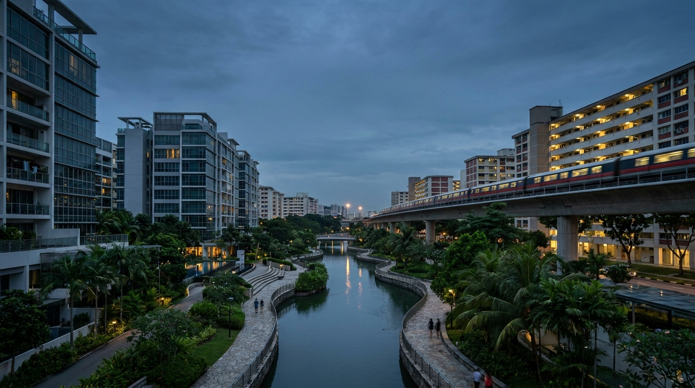
The districts that led the table share a profile: new rail, new schools, and buyers who live in what they buy.
The difference between the two lists is not just direction, it is coherence. In D19 the projects move together, which tells you the district itself was re-rated: buyers arrived for the location, and every building on it benefited. In D01 the projects diverge sharply — a 20.6% fall and a 13.1% rise inside the same square kilometre. When projects in one district move in opposite directions, the district is not the story. The individual building, its entry price, and its buyer base are.
That is also why we publish project names rather than hiding behind aggregates. An owner at Marina One deserves to see the number that describes their asset, and a buyer being shown a glossy brochure for a prime address deserves to know that the last five years inside that address ranged from minus twenty to plus thirteen depending on which door they walk through.
In D19 every project moved the same way — a district re-rating. In D01 they diverged by 34 points, so the building mattered more than the postcode.
07 · The counter-caseWe tried to break our own finding
The two strongest objections to this article, tested against the data.
There is one obvious objection to everything above, and it deserves a proper answer rather than a footnote. A district’s median psf can fall without any individual home losing value, if the mix of what sells changes. If small units carry a higher psf and D01 sold proportionally fewer of them recently, the median would drop while every owner was fine.
So we broke D01 into unit-size bands and measured each band separately, start of window against end.
The objection fails. Every measurable band fell on its own terms: units under 700 sq ft by 5.8%, the 700–1,100 band by 14.5%, and 1,100–1,600 by 11.2%. Weighting those within-band changes by their original share of the market gives a like-for-like fall of 11.3% — marginally worse than the 10.5% headline. Mix accounts for 0.8 of a percentage point. The decline is real.
It is worth naming the second objection too: that 2021 was simply a peak, and any measurement from a peak flatters the decline. That is partly true, and it is exactly why we show the monthly series rather than only the two endpoints. The D01 line does not fall off a cliff in early 2022 and then sit flat; it drifts downward across the middle of the window and has not recovered its starting level at any point since. A peak-effect story would show a sharp early drop and then a return. This does not.
Where the finding genuinely needs qualifying is at project level. One Shenton rose 13.1% over the same five years, in the same district, under the same policy regime. Prime did not fail as a category. Specific projects, bought at specific prices, failed — and the common thread among the fallers is that they were bought near the top of the last cycle, priced for a foreign investment demand that policy then removed.
That distinction matters more than the headline. “Avoid D01” is the wrong lesson. “Interrogate the entry price and the buyer base behind it” is the right one.
Inside one district, five years ranged from −20.6% to +13.1% depending on which building — and which door — you walked through.
The mix objection fails — like-for-like the fall is 11.3%, slightly worse. But One Shenton rose 13.1% in the same district: the lesson is entry price, not postcode.
08 · Your moveWhat this means for you
Four situations, four decision rules — find yours.
If you own in a prime district
Your holding is not broken; it is being repriced against a different buyer base than the one that set your entry price. The practical question is not whether to panic but whether your exit assumes a buyer who still exists. Before listing, get the psf distribution for your own project rather than your district — as the charts above show, the range within D01 spans S$603 psf, and where your stack sits inside that range decides your price far more than the district label.
Price off your project’s distribution, not your district’s median. In D01 that range spans S$603 psf.
If you are upgrading from an HDB flat
The districts that outperformed are the ones you are most likely to be looking at anyway, which is the good news. The caution is timing: D26, D18 and D19 have already run 38.7%, 35.7% and 33.9% respectively. You are buying into strength, not into a discovery. Model your affordability against a scenario where the next five years deliver the median 24.8%, not the top-district 38.7%.
Underwrite the move at +24.8% over five years, not +38.7%. If it only works at the top-district number, it doesn’t work.
If you are a first-time buyer
The single most useful thing in this article for you is the overlap: the cheaper decile of Singapore’s most prestigious district (S$1,727 psf) now costs less per square foot than the dearer decile of a heartland one (S$1,980 psf). Prestige postcodes are not uniformly out of reach, and heartland ones are not uniformly cheap. Shop the distribution, not the reputation.
Compare the tenth percentile of a prime district against the ninetieth of a heartland one before ruling either out.
If you are investing
The five-year lesson is that policy risk concentrates wherever the buyer base is narrow. D01’s dependence on foreign capital was a strength until April 2023 and a liability the day after. Ask of any purchase: who is the next buyer, and what single policy change removes them?
If one policy change can remove your next buyer, that is concentration risk — price it in or walk.
The question to ask about any district
Every district in the table above answers three questions, and you can ask them of a district we have not covered. First: who buys here, and is that buyer base broad or narrow? Second: what is arriving — a rail line, a school, a mall, a redevelopment — and when? Third: what is the spread between the tenth and ninetieth percentile, and where in that spread does the specific unit sit? The districts that outperformed answered the first two well. The unit-level outcome, in every district including the losing one, was decided by the third.
Which district are you actually looking at?
We’ll run the same five-year cut you just read — on yours.
- Median psf 2021–22 vs 2025–26, and the change
- The full price spread, not just the median
- Which projects moved, named, with their numbers
One WhatsApp message back — usually same day.
We’ll WhatsApp your district report shortly — usually within the day.
09 · The recordAll 26 districts, five years
The full table behind every chart above. Median resale psf in the first twelve months of the window against the last twelve, the change between them, and the number of qualifying transactions each district contributed. Screenshot it; the figures are dated and we would rather you check them than trust us.
10 · MethodSources, limits and corrections
Data: URA caveat records, 133,323 private transactions, 2021-07 to 2026-07. Analysis universe: 61,135 strata non-landed resale transactions, Executive Condominiums excluded.
Windows: 2021-07 to 2022-06 versus 2025-08 to 2026-07. Threshold: minimum 40 qualifying transactions per district per window; 26 districts qualified.
Policy dates from our Singapore property policy knowledge base; ABSD revisions of December 2021 and April 2023, SSD holding-period extension of July 2025.
Known limits: caveats lag completion by a few weeks, so the most recent month is always provisional. Medians describe a district, never a specific unit — yours can and will differ from its district’s median.
Reproducibility: every figure in this article is generated by a single script (prime-district-myth.py) against the source dataset; if you spot an error, tell us and we will correct it in place with a dated note.
Not investment advice. Analysis of public transaction records, published to be argued with.
Your district isn’t your unit.
A median describes a neighbourhood. Your price is decided by your stack, your floor and your lease — and in D01 that spread runs S$603 psf. The Scenario Planner does that maths on your actual numbers.
Map my move →